Graphic Design for Lee-Davis Players, 2017-2018 Return to Portfolio
Related artwork includes posters, handbills, etc.
Artist, Ashton Will
Digital Art
Artist's Statement:
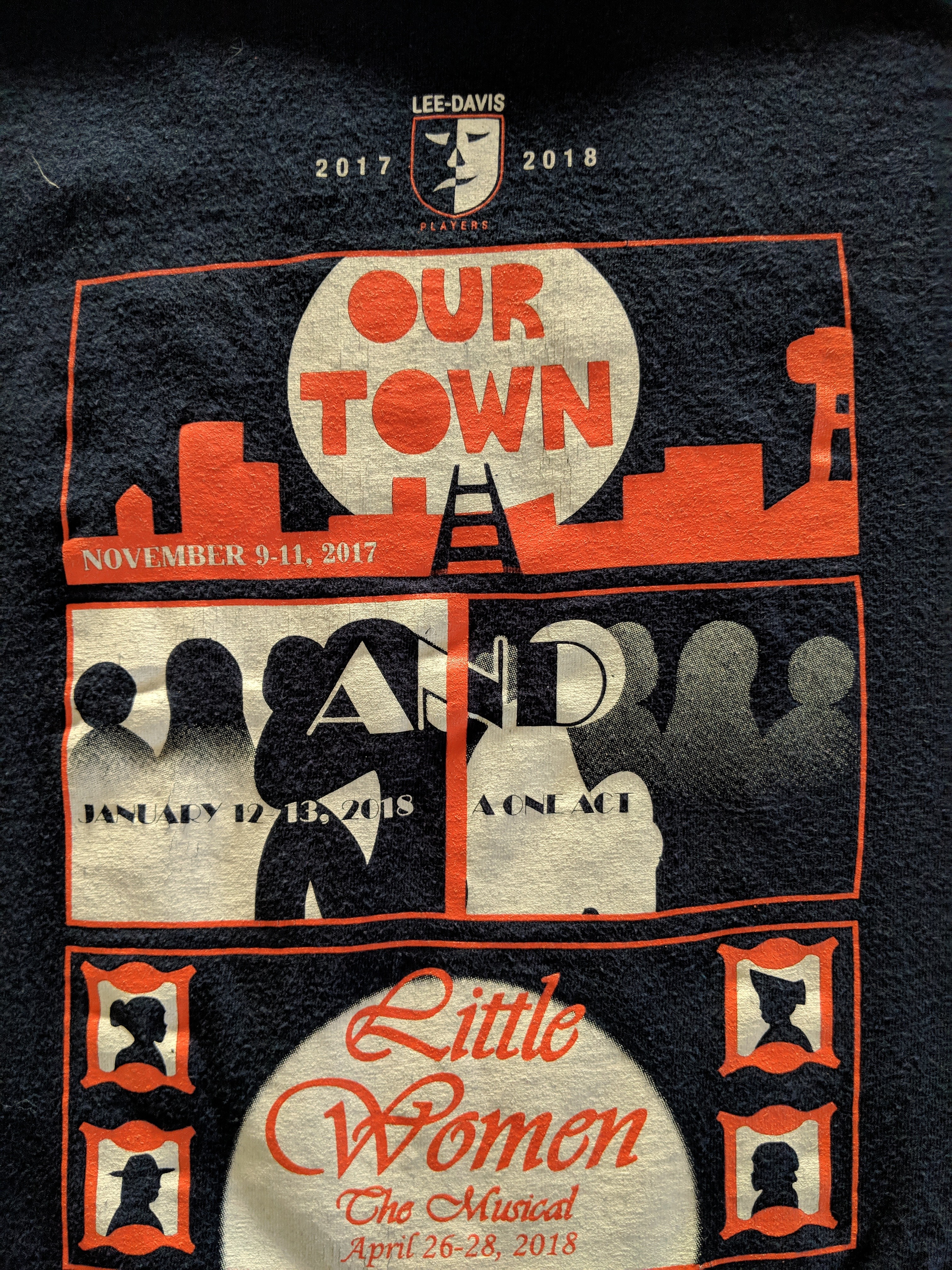
After being asked to do the graphic design for these shows, I researched the three productions. They were adjusted for marketing purposes. Our Town is about the everyday life in a small town, so I wanted to include a cityscape. My original sketch did not have the water tower, but I added it in later to offset the work and make it more interesting. The play also has symbolism in ladders and train tracks, so I made a ladder up to the moon that also functions as a track into the town. I made the font myself. "And" is a one act where the main character, Aaron, considers how millions of events are happening every second. He is coping with the fact that his sister was raped in the room next to his while he was playing a game. I wanted to convey the contrast with their events using black and white. The font is Broadway. Little Women is about the lives of four sisters as they are growing up, so I simply put portraits of them in the corners with Vivaldi Italic forming the words.
© 2017 to current year, Ashton Will. All rights reserved.